Introducing Sparkline for Power BI (UPDATED)
In the last post, we talked about the new API for visual development.
Today, we are very proud to introduce our first visual that uses the new development API: the Sparkline by OKViz.
First of all, what is a sparkline?
It is a small line chart, without axis or grids. It typically represents a measure variation over time, and it is often embedded in text.
Hey, wait a moment! Why we developed a custom visual that is similar to a built-in one (the Line chart)? Because sometimes, similar is not enough.
Our sparkline includes several useful options and takes great care to the use of real estate. Here are some examples:
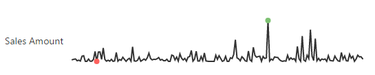 Showing highest/lowest data points
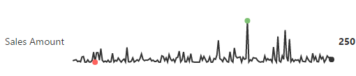 Showing the last value (it can be the sum of the values in the series or the average value)
 Showing a target value
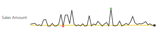
 Showing a target area
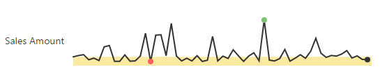
 Coloring the sparkline area
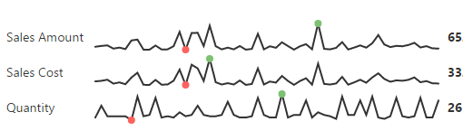 Showing multiple measures
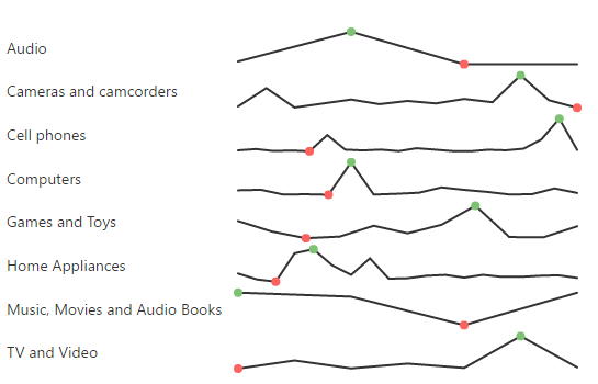
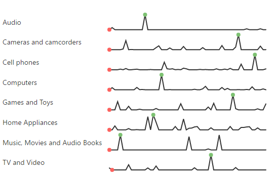 Showing multiple items in a category
 Ignoring null data points
As previously said, the new API are not completed yet, so we postponed some key feature as:
- Value label formatting (display unit and decimal places)
- Tooltips displaying
Please, be patient! We will include these feature after the required APIs will be released by Microsoft.
UPDATE Dec 20, 2016: we just released a new version that include the missing features!
You can watch a demo video and download it here.
What do you think about it? Use comments below and subscribe to stay updated.