Have you ever seen a measure spanned over multiple months represented by a Column Chart? Line Charts display a trend more clearly and they should be preferred for this scenario.
Moreover, while Column Charts must start the y-axis from zero because each column represents the magnitude of the measure, Line Charts can start the y-axis from any value in order to highlight important differences between intervals.
But what happens if you have a nominal scale instead of your x-axis representing time?
A Line Chart is no longer the right choice, because the line represents a connection between each point and suggests a continuity in the data, while a nominal scale defines different groups.
So, we have to come back to a Column Chart. Good, but what if you want to highlight the differences in magnitude?
Nominal scales and y-axis not starting from zero. Which is the right chart to use? The answer is: Dot Plot by OKViz.
In the above example, we have a standard Column Chart that works well in comparing categories but doesn’t highlight the differences as needed.
This time, we changed the y-axis of the Column Chart to display a more obvious comparison between categories – but in doing so we show misleading information to the users.
In the previous example, we used a Line Chart. It works well with a y-axis that doesn’t start from zero, but this kind of chart should not be used with a nominal scale because there is no connection between data points.
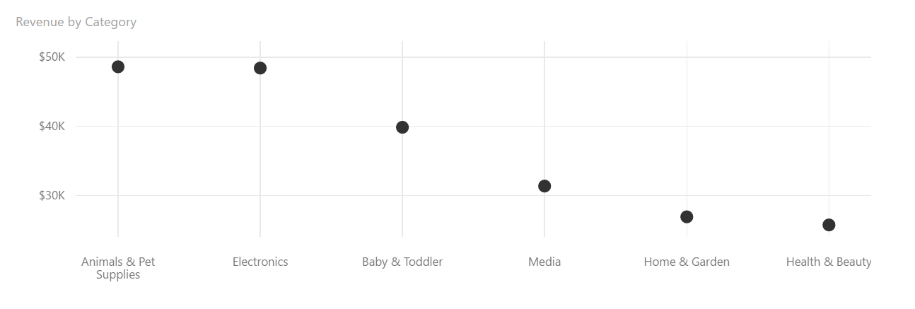
In the last chart, we used a Dot Plot – our new custom visual.
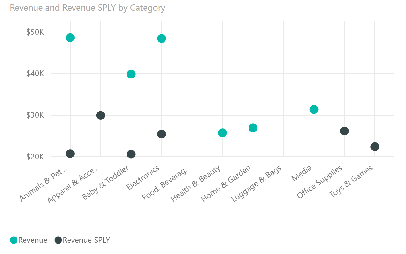
As you can see, it displays only one point for each category, and because it doesn’t focus on the actual value of the measure, you can have the y-axis starting from any value. Moreover, because there are no lines suggesting a continuity between the intervals, it can be used with a nominal scale.
The Dot Plot is the right choice in our case and can be used also to compare multiple measures efficiently within the same scale.
Ready to give it a try? Download the Dot Plot by OKViz for free.
Want to know more on how to choose the right charts for your reports? Look at the Chart Reference of SQLBI new video course: Power BI Dashboard Design Course


