Who is affected by color blindness?
We know that there are different kinds of color blindness, the most commons of which cause a distorted perception of Red-Green and Yellow-Blue colors.
The National Eye Institute says that at least 8% of men and 0.5% of women in Europe suffer of the Red-Green color disability, while the other deficiencies affect less than 1% of population.
Probably, one of your team-mates is color blind and you don’t even know it!
How color blind people see the colors?
To better understand the impact of color blindness, look at the following picture: on the left there is a simple Bar Chart; on the right, instead, there are a few simulations of the same chart seen by people affected by a color vision deficiency.
Normal vision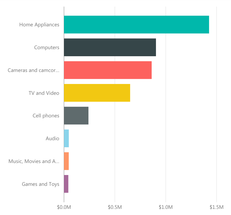 | Protanopia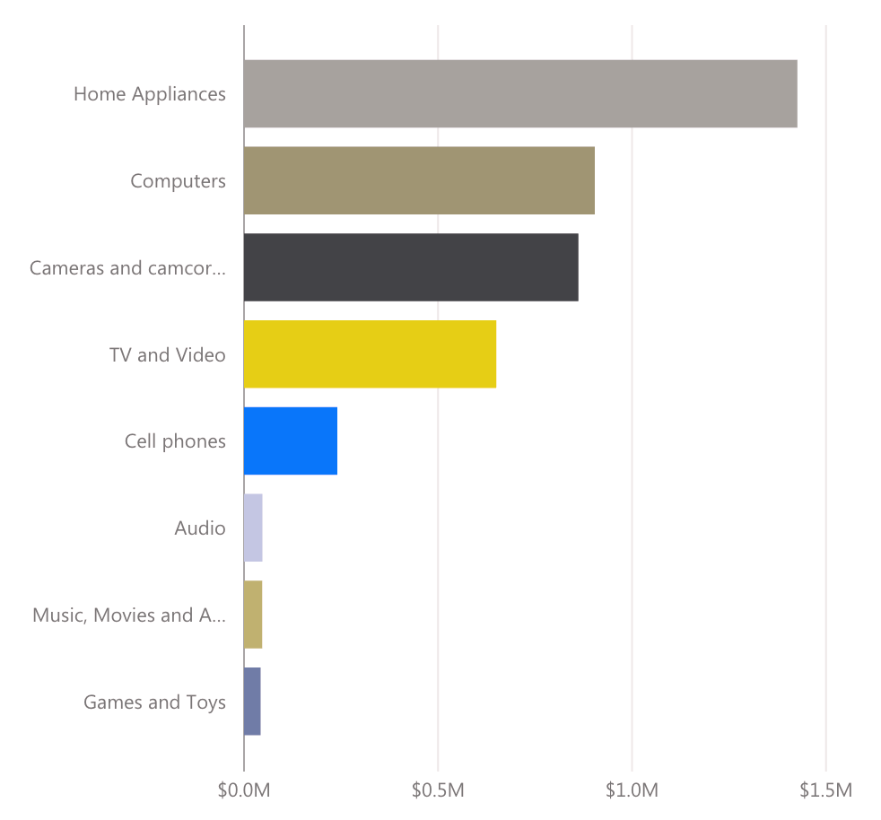 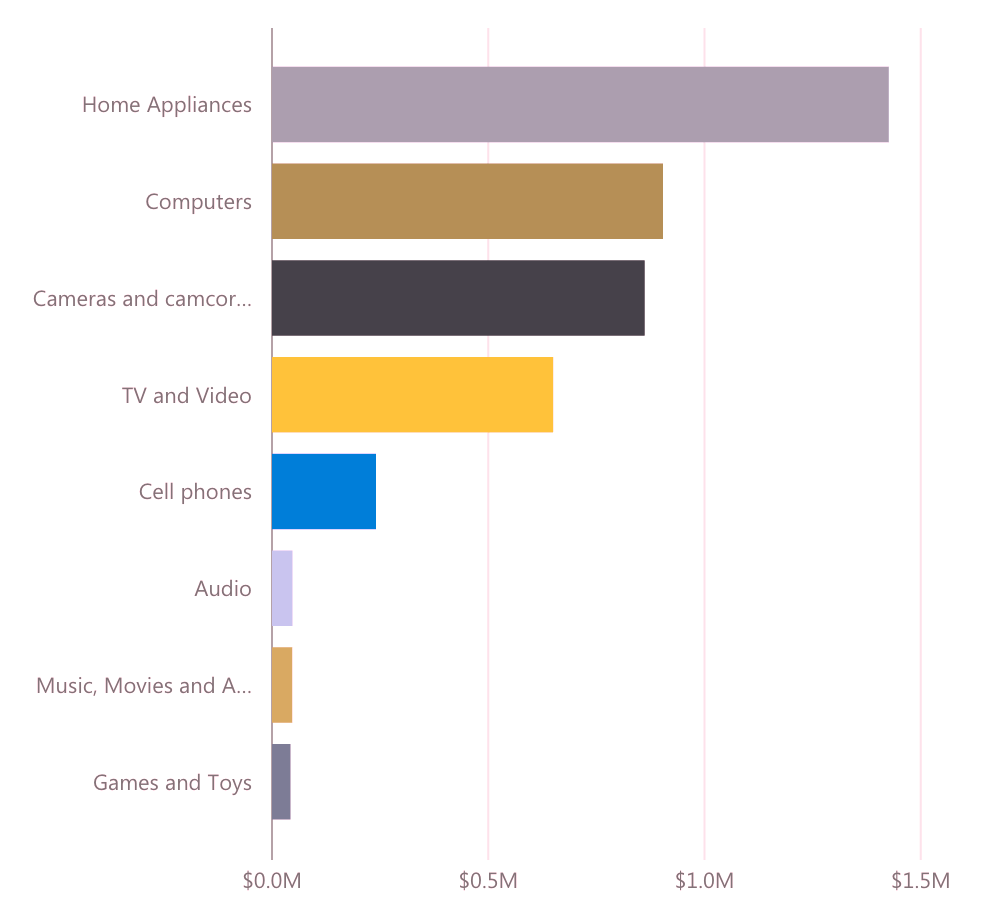 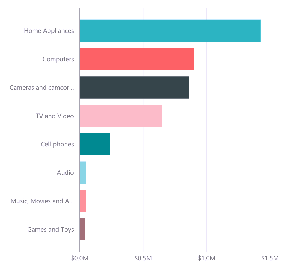 | Protanomaly 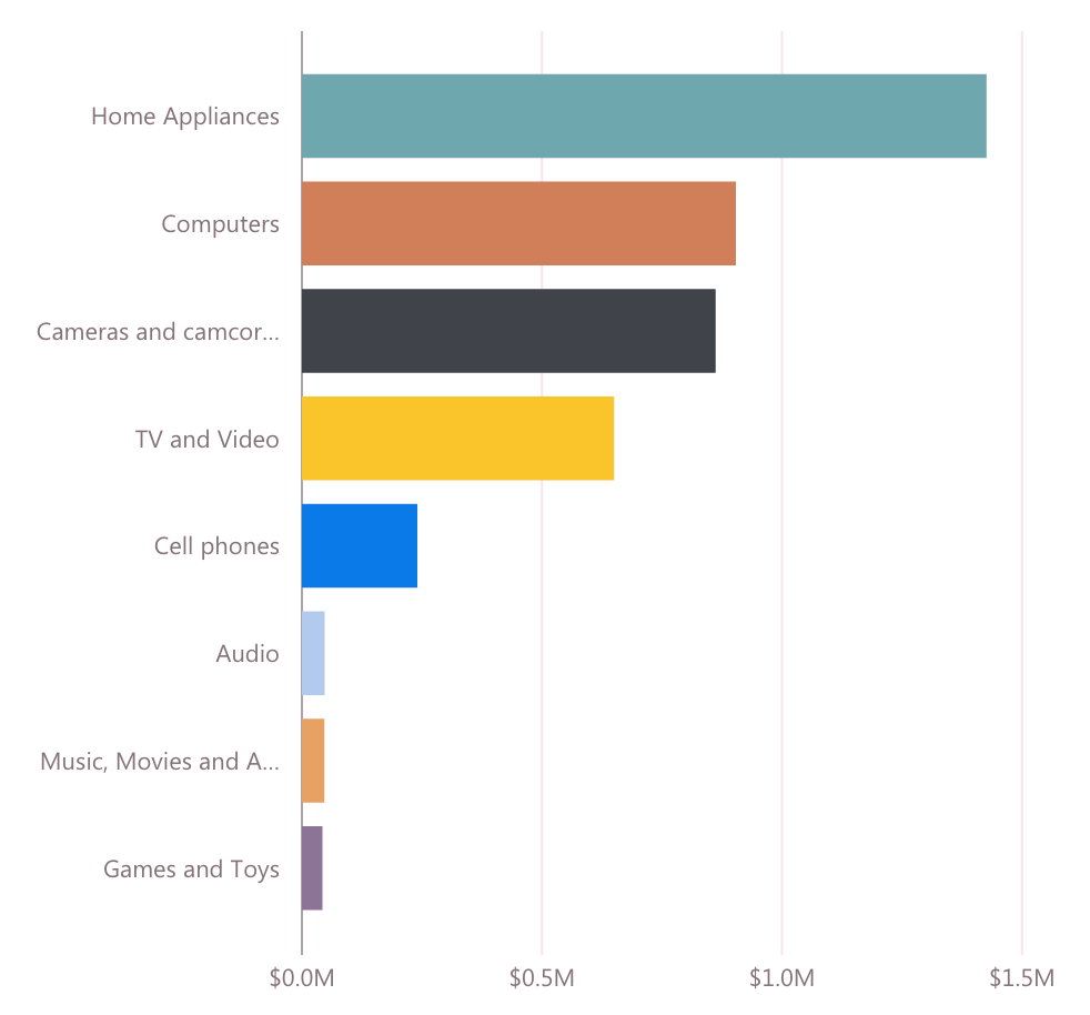 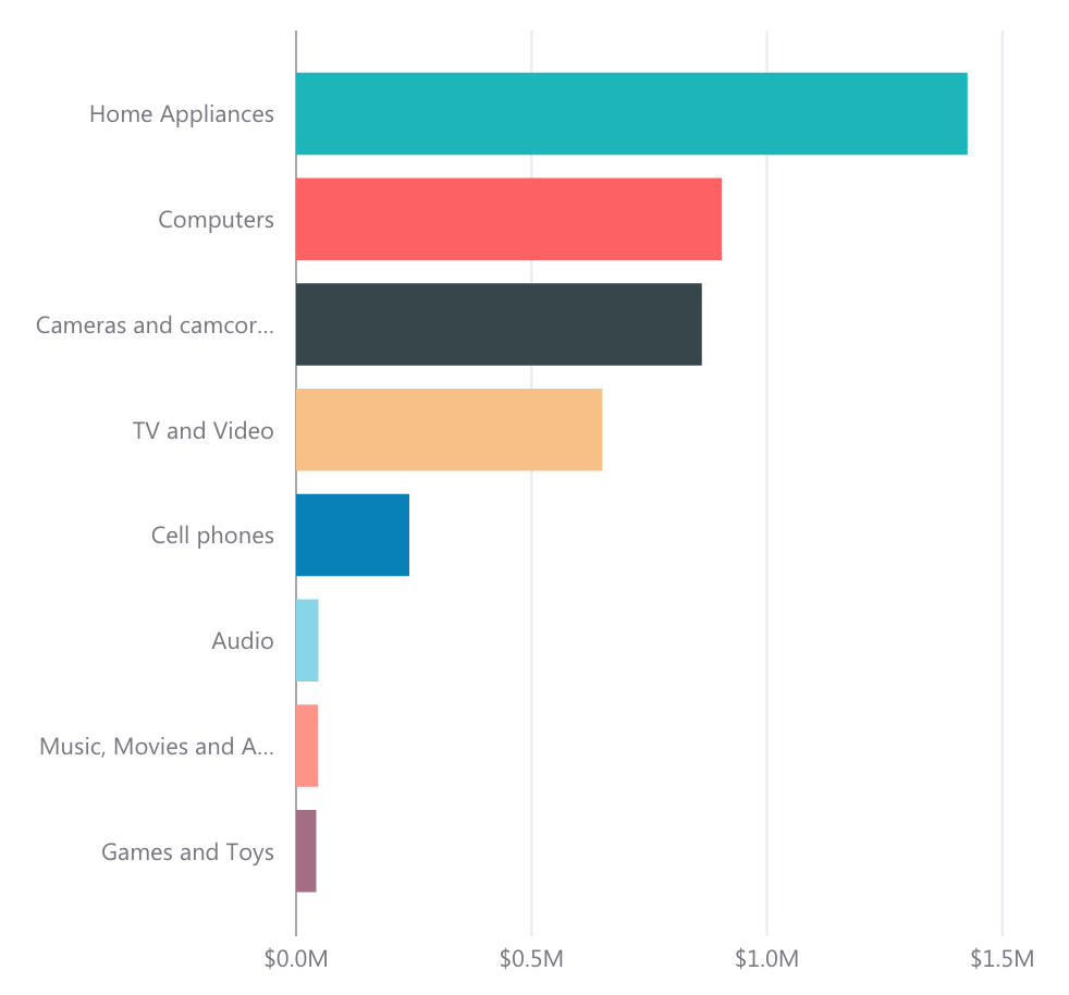 |
Power BI comes with a default color palette to use in charts that is quite good to avoid confusion, but if you use colors outside the standard range (for example, because you have corporate theme constraints), you can easily make mistakes.
Apply different color visions to your Power BI charts
At OKVIZ, we care about this problem, so we are proud to introduce the following initiatives:
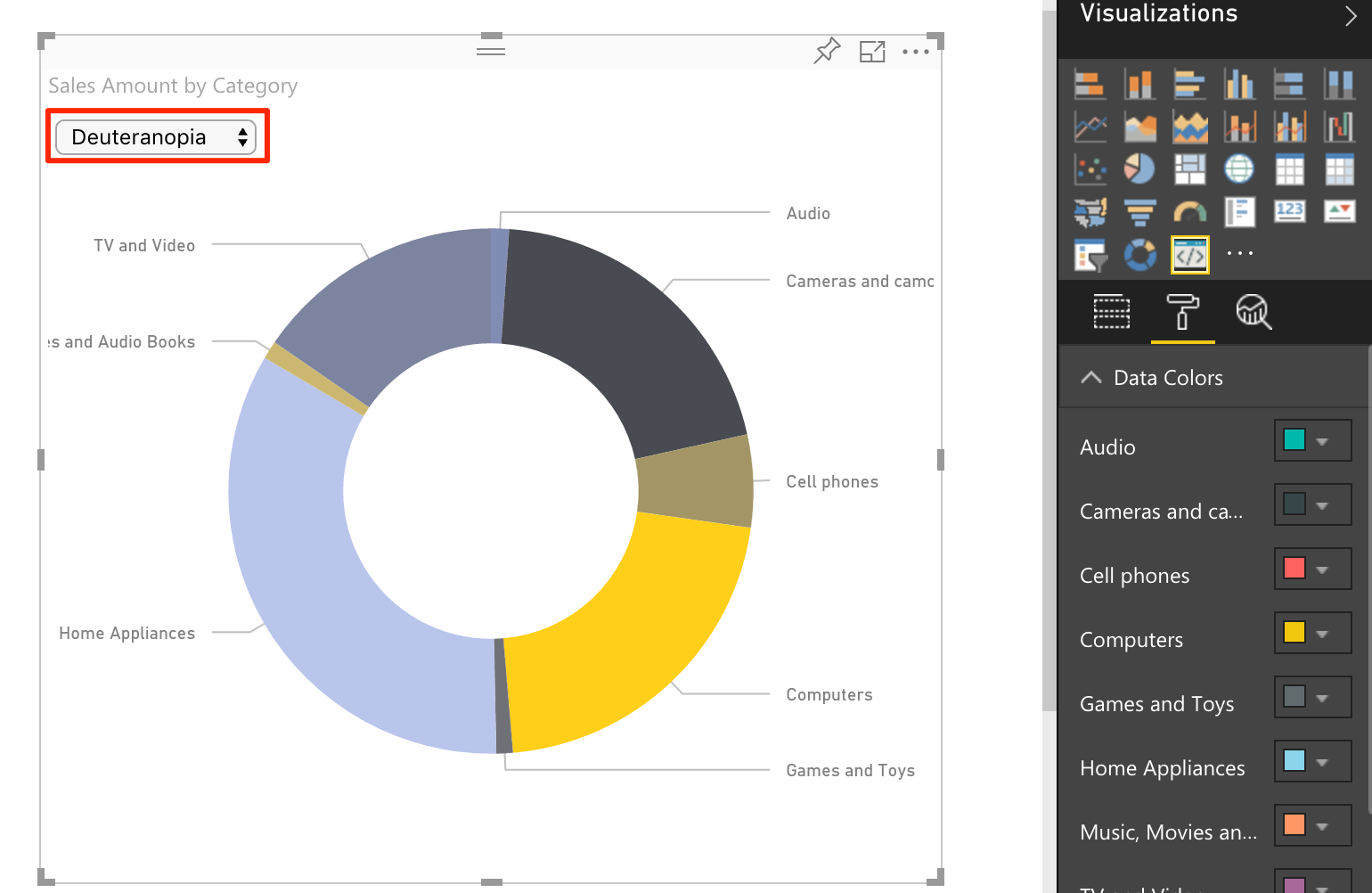
- First: from the next version, we will include a new section in the property panel of each of our custom visual, called Color Blindness by OKVIZ. Through this panel, you will be able to apply different color visions to the visual itself, to become aware and to calibrate hue and contrast of the colors to use.
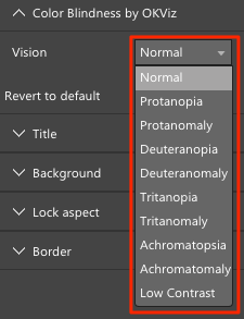
- Second: we made the above panel an open source library, FREE to use by all the developers. If you are one of them and want to implement it in your custom visual, just follow the steps described at https://github.com/okviz/ColorBlindness.
Would not it be great if this library was also implemented by the built-in visuals, too?
Third: we created a custom visual called Color Helper by OKVIZ, a simple Donut Chart with a dropdown list to apply different color visions to its slices. Color Helper is useful to temporarily replace any existing visual on your reports, just to figure out how people will see the colors that the visual itself uses