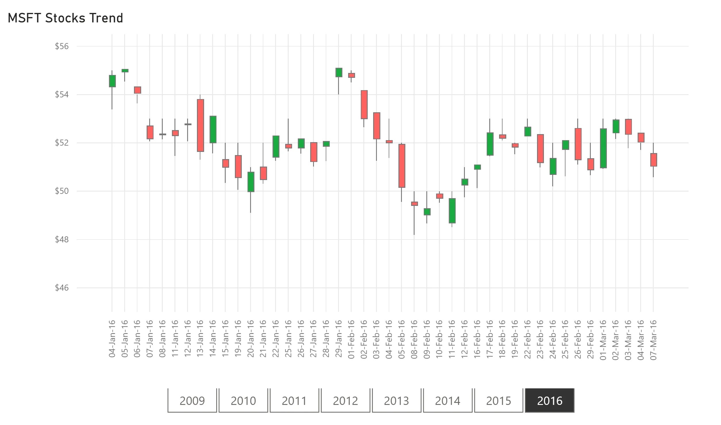
Candlestick
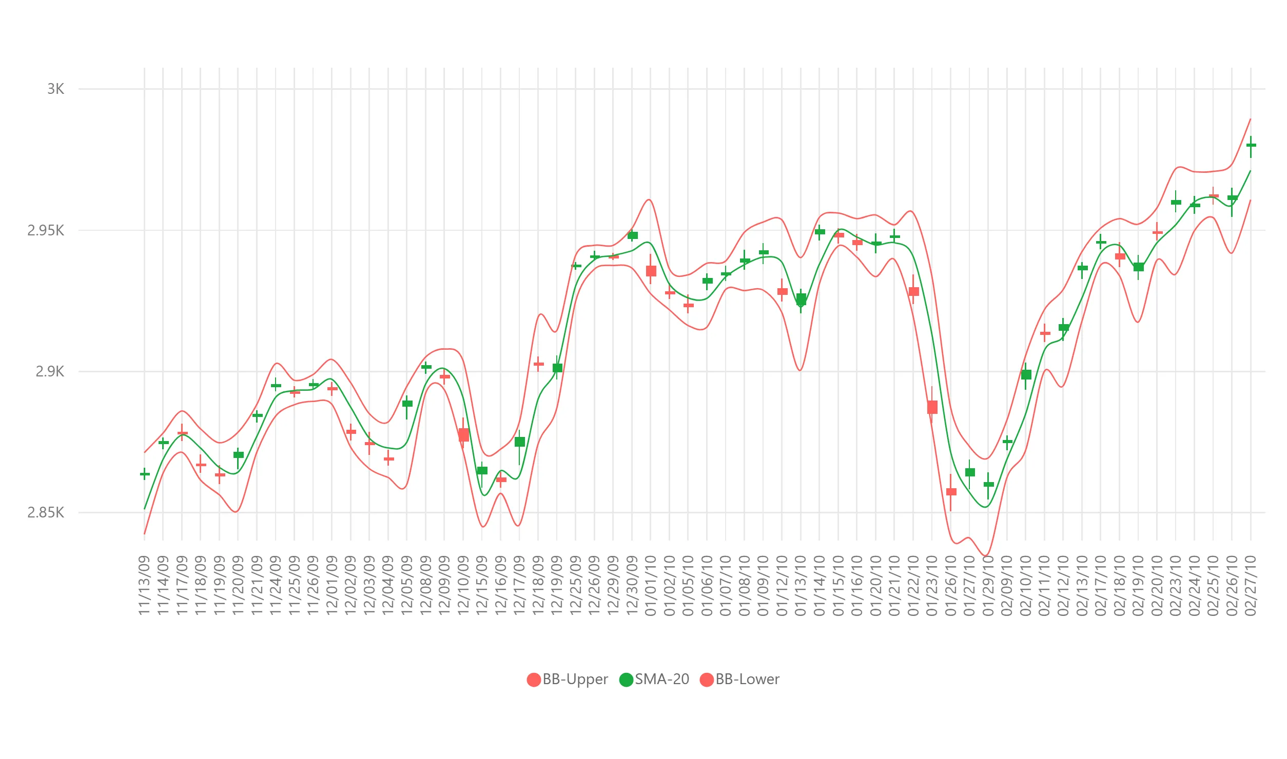
Candlestick by OKVIZ is used to describe the price variations of a stock, derivative, or currency. Each candle in the chart typically shows four price values: high, low, open, and close. This visual allows you to define multiple trend lines for analytics purposes, such as the Bollinger Bands.
(Desktop, Mobile, Web, Server, Embedded)
Questions & Answers
Do you have a question about Candlestick? See the list below for our most frequently asked questions.
If your question is not listed here, then please contact us.
Custom visuals are components that extend the visualization capabilities of Power BI. They provide advanced features not available in built-in visuals.
Yes, free OKVIZ visuals are certified by Microsoft.
No, we don't send any data from your reports to third-party services. We only connect to our servers to validate the license and to check for updates.
No, our visuals are currently only available in English. However, most of the messages displayed in the report can be customizable.
If you discover a bug while using our products, please visit our Support page, where you can report the issue. Our team will investigate the problem and work to resolve it as quickly as possible.
If you have an active subscription and prefer to communicate privately, please do not hesitate to send an email to support@okviz.com.